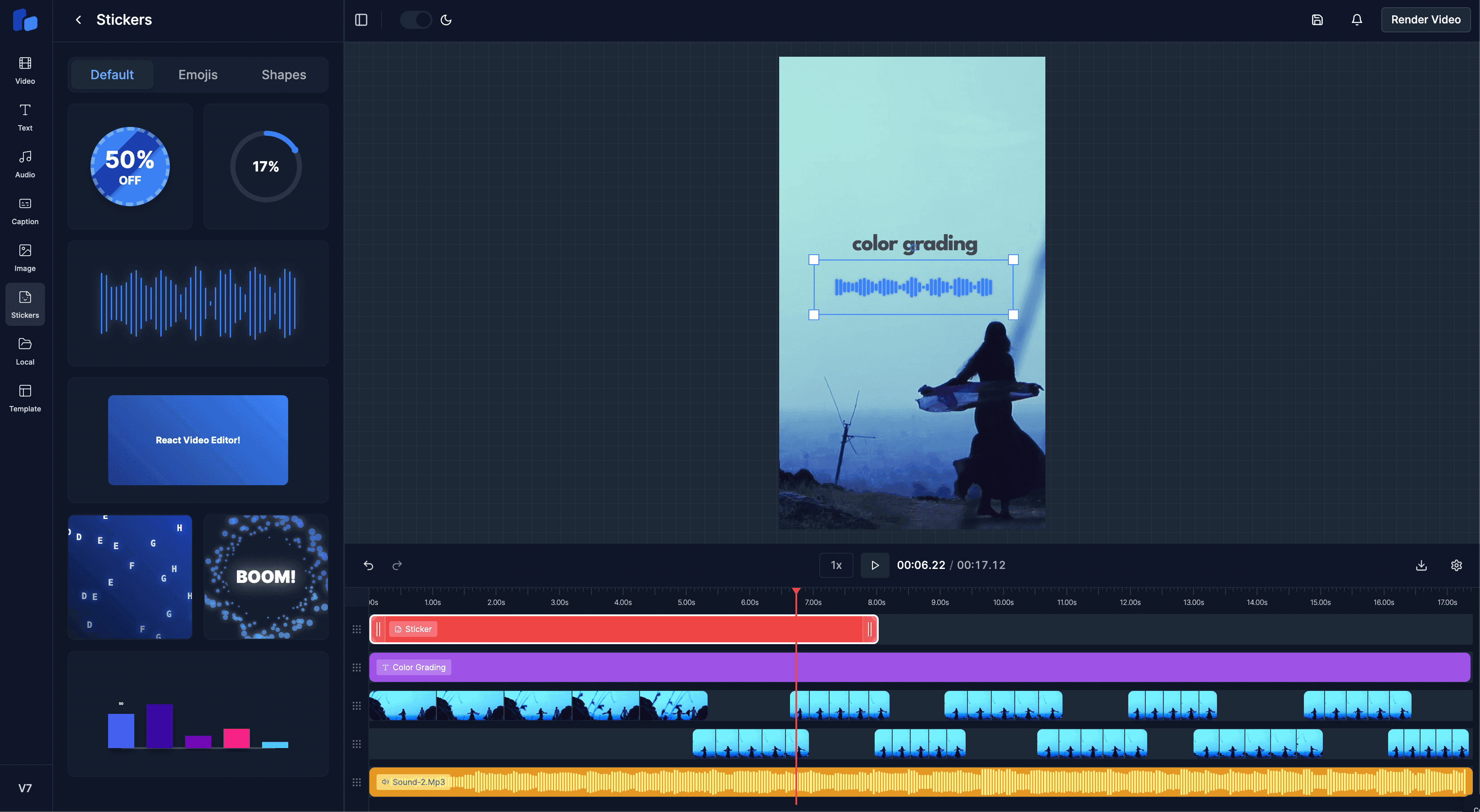
Understanding how Stickers work in React Video Editor
A deep dive into how the sticker system works inside RVE. Learn how stickers are structured.
Sam
Creator or RVE
Stickers are a new and engaging way to enhance videos. In React Video Editor, we've built a modular system to handle adding, displaying, and managing stickers. This post will walk you through the core components involved and show you how easy it is to add your own custom stickers!
We'll focus on three main files and one directory:
- sticker-templates/: The directory where all individual sticker components and their configurations live.
- sticker-helpers.tsx: A helper file that acts as a central registry for all available sticker templates.
- StickersPanel.tsx: The UI component that users interact with to browse and add stickers to the timeline.
- StickerLayerContent.tsx: The component responsible for rendering a specific sticker onto the video canvas based on its properties.
Let's dive into how they work together.
1. The Sticker Templates (sticker-templates/)
This directory is the heart of our sticker collection. Each subdirectory or file within sticker-templates/ typically represents a single sticker or a group of related stickers (like emoji-sticker or shapes).
Inside each template's file (e.g., discount-sticker.tsx), you'll usually find two main parts:
- The React Component: This is the visual part of the sticker. It's a standard React component that defines what the sticker looks like and how it behaves (e.g., animations). It receives props like dimensions, position, and any specific configuration defined for that sticker type.
- The Configuration Object: This object, often defined using a structure like
StickerTemplate(likely defined inbase-template.tsx), holds metadata about the sticker. This includes:id: A unique identifier (e.g.,"discount-sticker").category: How the sticker should be grouped in the UI (e.g.,"Animated","Shapes").Component: A reference to the React component itself.defaultProps: Default settings like initial size, duration, or custom styles.layout: Optional info on how it should appear in the preview panel (e.g.,doublewidth).
Think of sticker-templates/ as a library of available sticker designs and their blueprints.
2. The Sticker Registry
sticker-helpers.tsx
How does the rest of the application know which stickers exist and where to find them? The sticker-helpers.tsx file acts as a central hub or "registry":
- Imports Templates: It explicitly imports the configuration object (like
discountSticker,emojiStickers) from each template file withinsticker-templates/. - Creates Master List: It aggregates all imported templates into a single array (e.g.,
templates). - Organizes Templates: It processes this list to create useful data structures:
templatesByCategory: An object where keys are category names (e.g.,"Shapes") and values are arrays of templates belonging to that category. This is perfect for organizing the UI.templateMap: An object where keys are the unique stickerids and values are the corresponding template objects. This allows for quick lookups when we need to render a specific sticker.
- Provides Helper Functions: It exports functions like
getStickerCategoriesandgetTemplatesForCategoryfor easy access to this organized data.
Essentially, sticker-helpers.tsx knows everything about the available stickers without needing to contain the visual rendering logic itself.
3. The Browsing UI
StickersPanel.tsx
This is what the user sees when they want to add a sticker. StickersPanel.tsx uses the information provided by sticker-helpers.tsx to build the UI:
- Gets Categories: It calls
getStickerCategories()to get a list of all categories. - Creates Tabs: It renders tabs for each category.
- Gets Templates for Category: For the selected tab, it calls
getTemplatesForCategory(categoryName)or usestemplatesByCategorydirectly. - Renders Previews: It maps over the templates for the current category and renders a
StickerPreviewcomponent for each one.- The
StickerPreviewcomponent is clever: it uses Remotion's<Player>component to show a small, animated preview of what the sticker actually looks like in action! It uses theComponentanddefaultPropsfrom the template's configuration.
- The
- Handles Adding Stickers: When a user clicks a
StickerPreview, thehandleStickerClickfunction is triggered. This function:- Finds the full template configuration using the template ID.
- Determines a suitable position (
from,row) on the timeline usinguseTimelinePositioning. - Creates a new
Overlayobject. This object represents the specific instance of the sticker being added to the timeline. Crucially, it includes:type: OverlayType.STICKERcontent: template.config.id(This links the overlay instance back to its template!)- Position (
left,top), dimensions (width,height), timing (from,durationInFrames), and styling information.
- Calls
addOverlay(fromEditorContext) to add this new overlay object to the editor's state.
So, the StickersPanel is the bridge between browsing available designs and placing a specific instance onto the editing timeline.
4. Rendering the Sticker on Canvas
StickerLayerContent.tsx
Okay, an overlay object representing our chosen sticker exists in the editor's state. How does it actually appear on the main video preview canvas? Yep you guessed it. StickerLayerContent.tsx.
This component is rendered for each overlay object that has type: OverlayType.STICKER. Its job is simple but crucial:
- Receives Overlay Data: It gets the specific
overlayobject as a prop. - Finds the Template: It uses the
overlay.content(which holds the template ID) as a key to look up the corresponding template configuration in thetemplateMapimported fromsticker-helpers.tsx. - Gets the Component: If a template is found, it extracts the actual React component (
template.Component) from the configuration. - Renders the Component: It renders the extracted
Component, passing down the necessary props derived from theoverlayobject (like dimensions, styles) and the template'sdefaultProps.
StickerLayerContent acts as the final step, dynamically rendering the correct sticker visual based on the template ID stored in the overlay data.
Putting it All Together (The Flow)
- Developer: Creates a new sticker component and config in
sticker-templates/. - Developer: Imports and adds the new sticker config to the
templatesarray insticker-helpers.tsx. - App:
sticker-helpers.tsxautomatically organizes the new sticker intotemplatesByCategoryandtemplateMap. - User: Opens the editor,
StickersPanel.tsxusessticker-helpersto display the new sticker in the correct category tab viaStickerPreview. - User: Clicks the new sticker's preview.
- App:
StickersPanel.tsxcreates anOverlayobject containing the new sticker's ID (content), position, size, etc., and adds it to the editor state. - App: The main editor canvas renders layers based on the editor state. For the new sticker overlay, it renders
StickerLayerContent.tsx. - App:
StickerLayerContent.tsxuses thecontent(template ID) from the overlay prop, looks up the component intemplateMap(fromsticker-helpers.tsx), and renders the actual sticker component fromsticker-templates/.
How to Add Your Own Sticker
Now for the exciting part! Adding a new sticker is straightforward thanks to this modular design:
-
Create Your Sticker Files:
- Inside the
components/editor/version-7.0.0/templates/sticker-templates/directory, create a new file (e.g.,my-cool-sticker.tsx) or a new directory if it's complex.
- Inside the
-
Define the Component: In your new file, create your React component. This component will receive props based on the
Overlaytype and any customdefaultPropsyou define.// components/editor/version-7.0.0/templates/sticker-templates/my-cool-sticker.tsx import React from "react"; import { StickerProps } from "./base-template"; // Assuming StickerProps is defined here export const MyCoolStickerComponent: React.FC<StickerProps> = ({ overlay, isSelected, }) => { // Use overlay.width, overlay.height, overlay.styles, etc. // Add your awesome sticker visuals and animations here! return ( <div style={{ width: "100%", height: "100%", background: "purple", color: "white", display: "flex", alignItems: "center", justifyContent: "center", borderRadius: "50%", }} > Cool! </div> ); }; -
Define the Configuration: In the same file, define and export the configuration object for your sticker. Make sure the
idis unique and thecategoryexists or is a new one you want to create.// components/editor/version-7.0.0/templates/sticker-templates/my-cool-sticker.tsx import { StickerTemplate } from "./base-template"; // ... import your Component ... export const myCoolSticker: StickerTemplate = { config: { id: "my-cool-sticker", // Unique ID name: "My Cool Sticker", // Display name (optional) category: "Fun", // Category for the panel Component: MyCoolStickerComponent, // Reference your component defaultProps: { // Default properties when added styles: { opacity: 1, // Any other default styles }, durationInFrames: 90, // Default duration ~3s at 30fps }, // layout: "double", // Optional: if it needs more space in the preview panel // isPro: false, // Optional: mark as pro feature }, }; -
Register the Sticker: Open
components/editor/version-7.0.0/templates/sticker-templates/sticker-helpers.tsx.- Import your newly exported configuration object:
import { myCoolSticker } from "./my-cool-sticker"; // Add this line - Add your imported configuration object to the
templatesarray:const templates: StickerTemplate[] = [ discountSticker, circularProgress, // ... other stickers ...shapeStickers, myCoolSticker, // Add your sticker here! // Add other sticker templates here ];
- Import your newly exported configuration object:
That's it! The sticker-helpers.tsx file will automatically handle the rest. When you reload the editor, your "My Cool Sticker" should appear in the "Fun" category tab within the StickersPanel, ready to be added and rendered via StickerLayerContent.
Conclusion
The sticker system in React Video Editor is designed to be flexible, intuitive, and developer-friendly. By breaking things down into clear componentsM from templates to rendering, we've made it easy to extend the editor with your own creative ideas.
Whether you're adding fun emojis, animated callouts, or branded overlays, the structure is already in place for you to drop in new stickers with minimal friction.